Earthy color palettes are about bringing nature inside. Not recreating it exactly—more like bottling a feeling. The warmth of red soil under your feet. The calm of endless grasslands. The richness of a landscape that’s been there forever.
Four years ago, I spent a week in Senegal watching the sun disappear into the Atlantic. The colors that spread across the sky felt impossible to describe. Burnt orange bleeding into coral pink, fading into deep terracotta. I kept thinking: there’s no way a painting could ever capture this. But that feeling? That could live on in my home.
These seven earthy color palettes do exactly that. Each one carries a place, a memory, a moment worth holding onto.
This post contains affiliate links. I may earn a small commission if you purchase through them, at no extra cost to you.
Jump to:
- Why Earthy Color Palettes Work
- How to Use These Earthy Color Palettes
- 1. Savanna Grassland: Earthy Color Palette of Endless Horizons
- 2. Sahara Dusk: Soft Power in Earthy Tones
- 3. Coffee Village: Rich Earthy Color Palette in Every Shade of Brown
- 4. Laterite Earth: Terracotta Earthy Color Palette from West Africa
- 5. Namib Dunes: Deep Ochre Earthy Tones
- 6. Sunset Over Dakar: Vibrant Earthy Color Palette
- 7. Baobab Bark: Earthy Color Palette from Sacred Trees
- Making Your Earthy Color Palette Look Spectacular
Why Earthy Color Palettes Work
Earthy tones ground a space. They create rooms that feel anchored in something real.
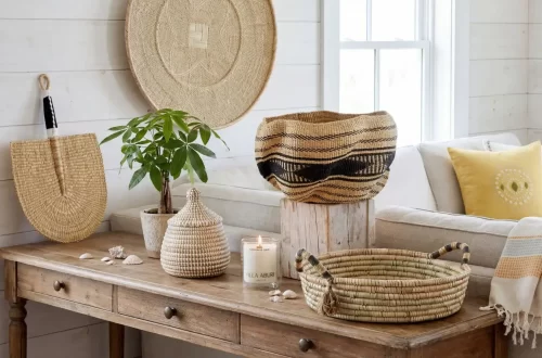
Browns, tans, terracottas, ochres—these are colors of materials humans have used forever. Clay bricks. Woven grasses. Carved wood. Natural dyes pulled from bark and roots.

In West African villages, entire homes get built from banco clay. The walls carry these exact shades. Rich brown mixed with straw, dried under relentless sun. It’s gorgeous because it’s authentic, and that authenticity translates straight into modern interiors.
Earthy color palettes make spaces feel lived-in immediately. Warm but not overwhelming. Sophisticated without trying too hard.
You May Also Like: 11 African Interior Design Ideas for a Stunning Home
How to Use These Earthy Color Palettes

Before we get into each palette, here’s a general blueprint that works:
- Start with your lightest shade for walls. This creates your base. Everything else sits on this. But although most of the walls are better off light, you can also have fun with an accent wall.
- Use mid-tones for most of the bigger furniture. Sofas, rugs, curtains. These anchor your room and take up visual space. Having them in mid-tones is softer on the eye but there’s always room for one statement piece.
- Bring in a diverse range from lightest to darkest colors through accents. Throw pillows, artwork, or statement furniture pieces. These create depth and stop the space from feeling washed out.
- Layer your earth tones. Don’t match everything perfectly. Real landscapes have variation. Your room should too.
Alright, now let’s get into the good stuff.
1. Savanna Grassland: Earthy Color Palette of Endless Horizons
Standing in Tanzania’s Serengeti plain, you realize how many shades of tan and gold actually exist. The grass shifts from pale straw to deep honey depending on the light. Shadows create these pockets of warm brown. Everything feels expansive and calm.
This earthy color palette captures that exact feeling. Gentle but grounded. Perfect for spaces where you need to breathe.
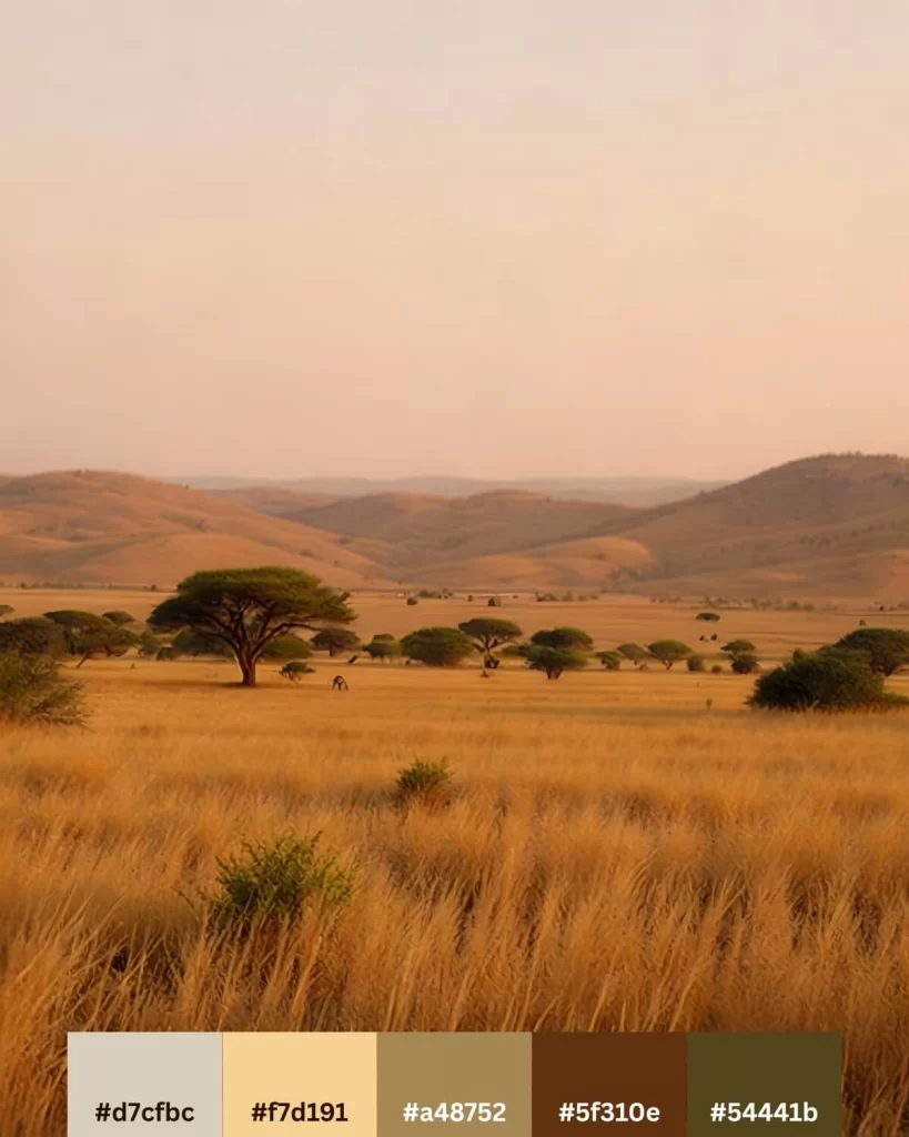
The Colors:
- #d7cfbc – Soft taupe
- #f7d191 – Light yellow
- #a48752 – Camel
- #5f310e – Cinnamon
- #54441b – Dark olive green
Where it works best: Living rooms that get great natural light. Bedrooms where you want calm. Any space that feels cramped—these colors create visual expansion.

How to style it: Keep walls light or warm. Bring in strong colors like cinnamon or dark olive green through your sofa. Add throw pillows in your lightest and darkest brown. Layer in decor that echo the landscape this palette comes from.
The Serengeti doesn’t shout. It just exists, confident and timeless. This palette does the same.
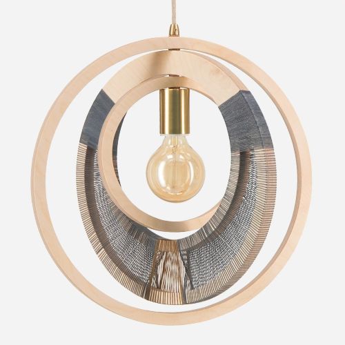
Our Savanna Picks:
from US $288
from US $78
2. Sahara Dusk: Soft Power in Earthy Tones
The Sahara at sunset is deceptively soft. Those dunes look gentle from a distance, all peachy-tan and warm beige. Then you remember this landscape has been here for millions of years: soft can still be powerful.
This earthy color palette carries a similar vibe: approachable warmth with serious staying power.
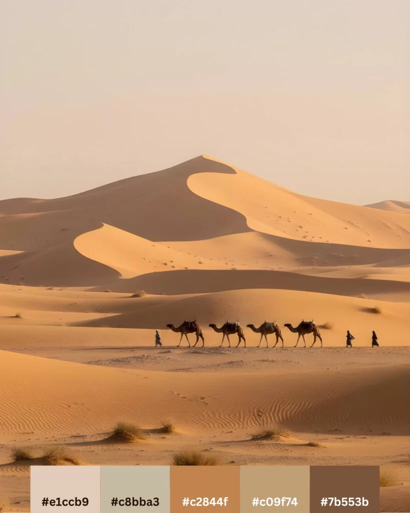
The Colors:
- #e1ccb9 – Beige
- #c8bba3 – Soft taupe
- #c2844f – Toffee
- #c09f74 – Sand
- #7b553b – Chocolate
Where it works best: Spaces that need warmth without heaviness, where you want that inviting energy.
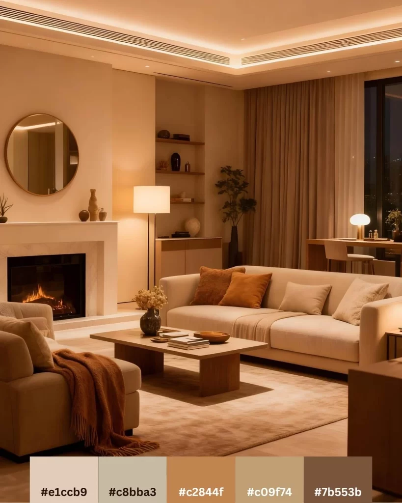
How to style it: These tones love texture. Think woven textiles from North African weavers, carved wooden bowls, terracotta pottery. The palette stays quiet while your textures add all the interest.
Sahara-inspired rooms feel quietly confident rather than decorated. Like pieces you’ve gathered over time from places that mattered.
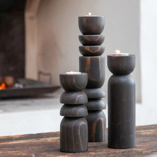
Our Desert Picks:
from US $238
3. Coffee Village: Rich Earthy Color Palette in Every Shade of Brown
Central African villages built from earth and wood carry every shade of brown you can imagine. Deep chocolate roof beams. Mid-tone clay walls. Lighter tan where sun has faded the surface. Coffee isn’t just a drink there—it’s the entire color story.
This earthy color palette goes all in on brown. And somehow? It never feels heavy.
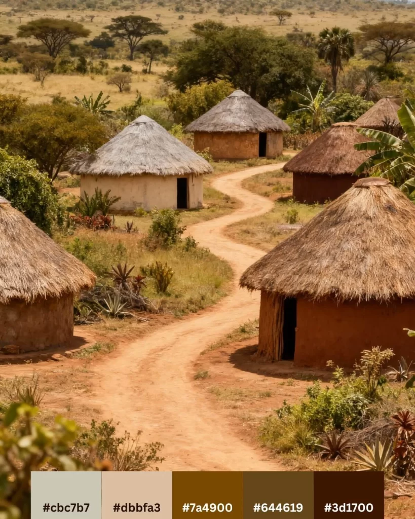
The Colors:
- #cbc7b7 – Light Clay
- #dbbfa3 – Tan
- #7a4900 – Caramel
- #644619 – Coffee brown
- #3d1700 – Dark mocha
Where it works best: Anywhere you want serious, grounded energy, but always elegant.
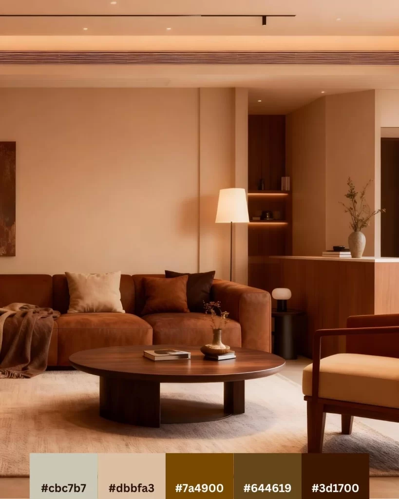
How to style it: This palette needs good lighting to really sing. Layer your browns deliberately—don’t let everything blend together. Use your darkest shade sparingly as an accent or for a statement piece of furniture. Bring in brass or copper metallics. They catch light beautifully against all that brown.
I did my Paris reading corner entirely in coffee tones. Added one brass floor lamp and a hand-carved wooden shield from Cameroon. The space feels like a cocoon now: warm and stylish.
Our Coffee Picks:
4. Laterite Earth: Terracotta Earthy Color Palette from West Africa
West African soil runs deep red. Laterite clay, rich with iron oxide, gives entire regions their signature color. Potters have worked this clay for thousands of years, shaping it into both functional and decorative items.
This earthy color palette brings that richness straight into your space. Bold but still earthy. Grounded in a shade that draws you in.
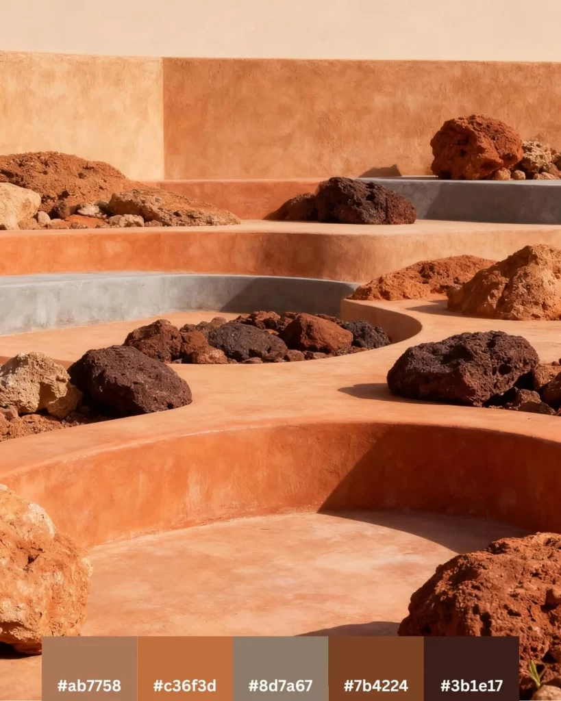
The Colors:
- #ab7758 – Light terracotta
- #c36f3d – Terracotta
- #8d7a67 – Clay
- #7b4224 – Cherry wood
- #3b1e17 – Dark mahogany
Where it works best: Spaces that can handle warmth and personality. Living rooms, dining rooms, creative studios.
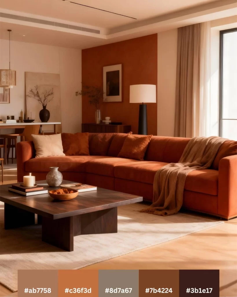
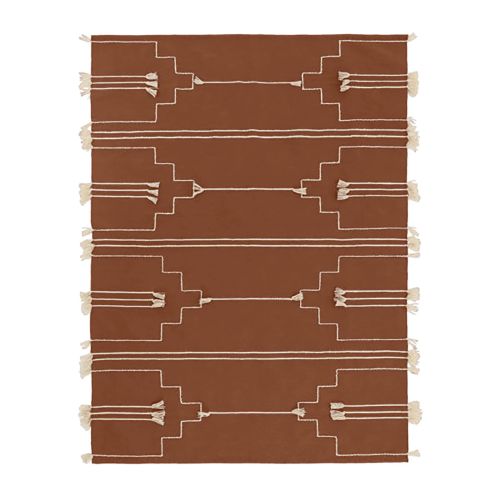
How to style it: Don’t be shy with these tones. Use that gorgeous terracotta as your main color, not just an accent. Paint one wall in your mid-tone orange. Add pottery in various shades of rust and clay. Bring in natural fiber rugs.
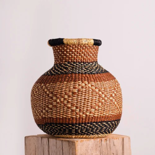
Authentic African pottery works perfectly here—Zulu pots, Nupe water vessels, any piece shaped from earth and fired by hand. They’re literally made from the same soils that inspired this palette.
Our Terracotta Picks:
from US $238
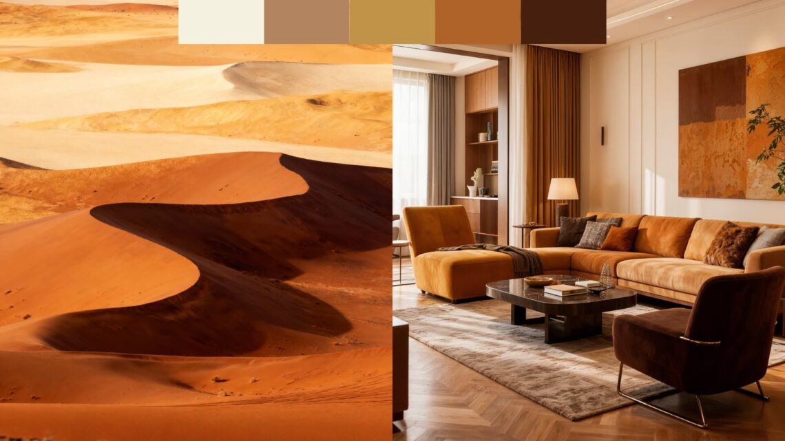
5. Namib Dunes: Deep Ochre Earthy Tones
The Namib Desert in Namibia holds some of Earth’s oldest dunes. The sand runs deep orange-gold, colored by iron oxidizing over millions of years. At certain times of day, those dunes glow like they’re lit from within.
This earthy color palette captures that intensity. Earth tones that make themselves known.
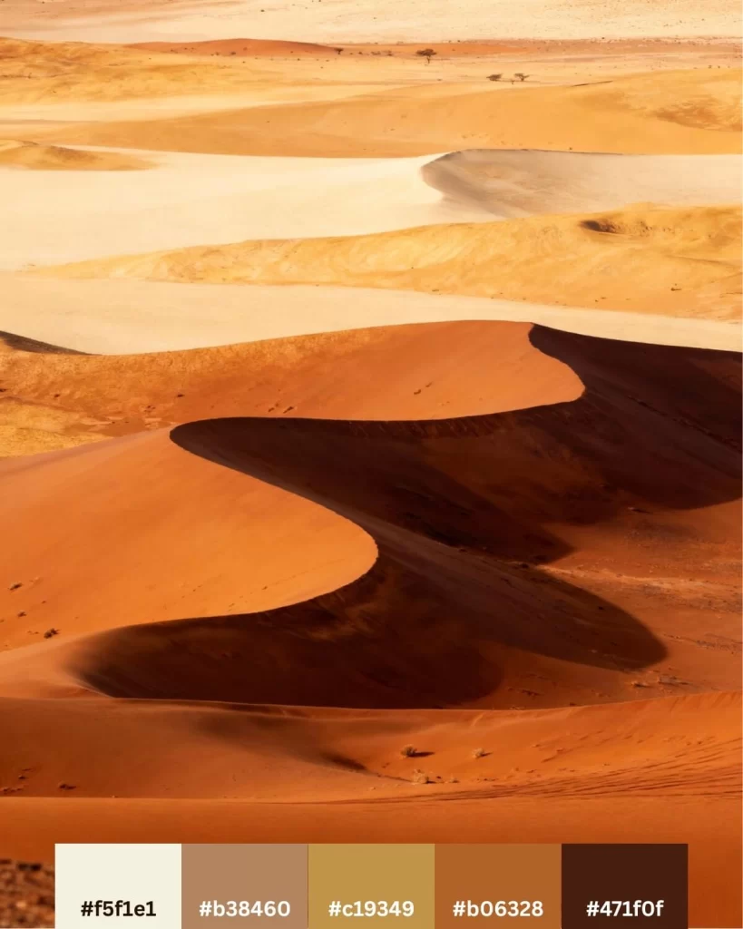
The Colors:
- #f5f1e1 – Extra light yellow
- #b38460 – Light terracotta
- #c19349 – Yellow ochre
- #b06328 – Windsor tan
- #471f0f – Dark Mahogany
Where it works best: Statement rooms. These are the spaces you want to style bold and bright.
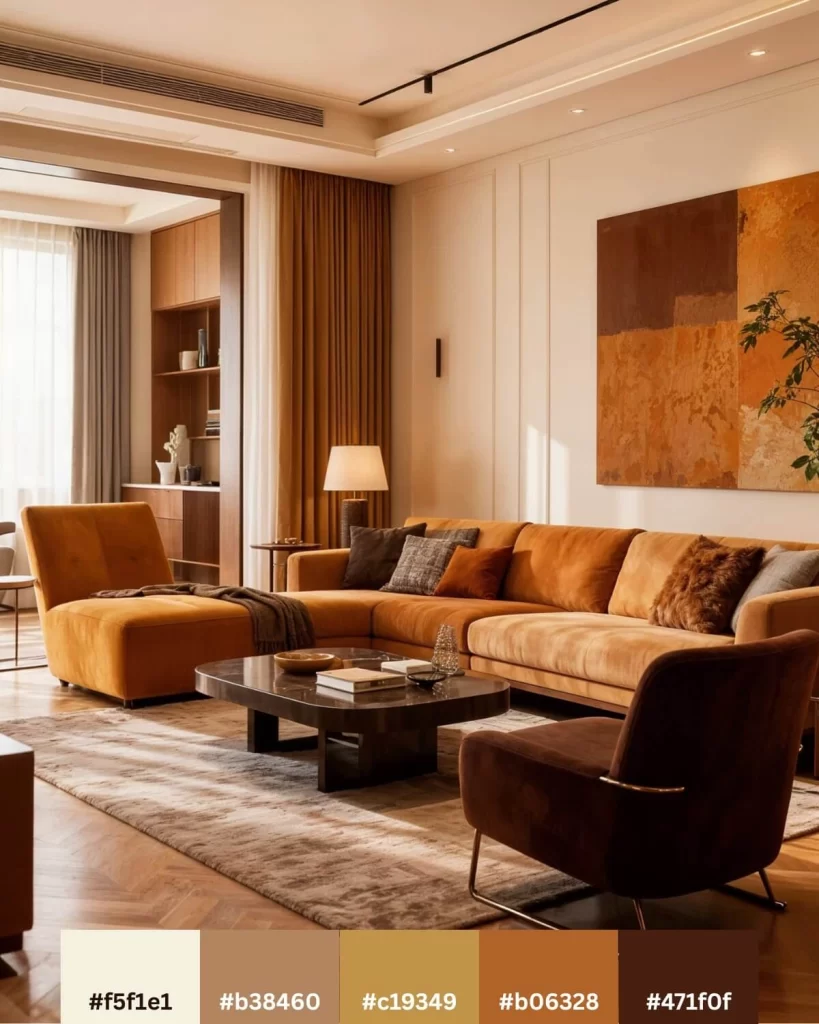
How to style it: This palette works beautifully with natural materials. Leather furniture. Woven wall hangings. Carved wood pieces. Keep metals warm—aged brass or copper, never chrome.
Balance is everything here. Use your lighter tones generously so the space doesn’t feel too intense. Let your deep ochres punctuate but not overwhelm.
Our Dune Picks:
6. Sunset Over Dakar: Vibrant Earthy Color Palette
I’ve watched sunsets across three continents. None compare to Senegal. The sky absolutely erupts. Deep coral. Burnt orange. Golden yellow bleeding into warm sand tones. Even that rich burgundy-brown that shows up right before night falls completely.
This earthy color palette has more energy than the others, but it’s still grounded.
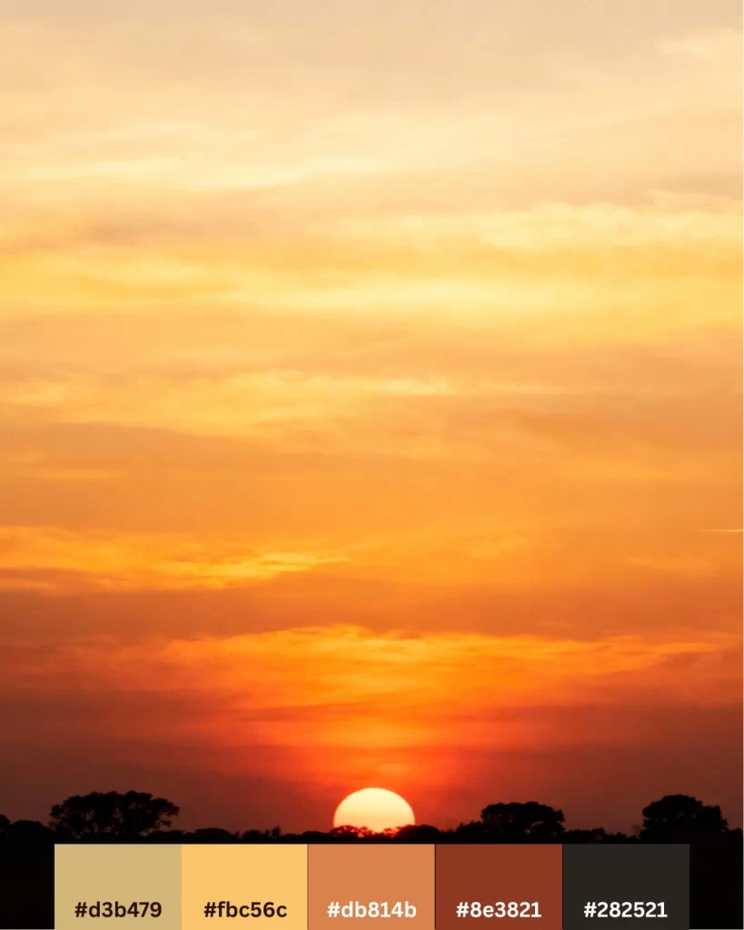
The Colors:
- #d3b479 – Earth yellow
- #fbc56c – Golden yellow
- #db814b – Copper Tan
- #8e3821 – Burnt Sienna
- #282521 – Charcoal
Where it works best: Spaces where you want warmth and life.
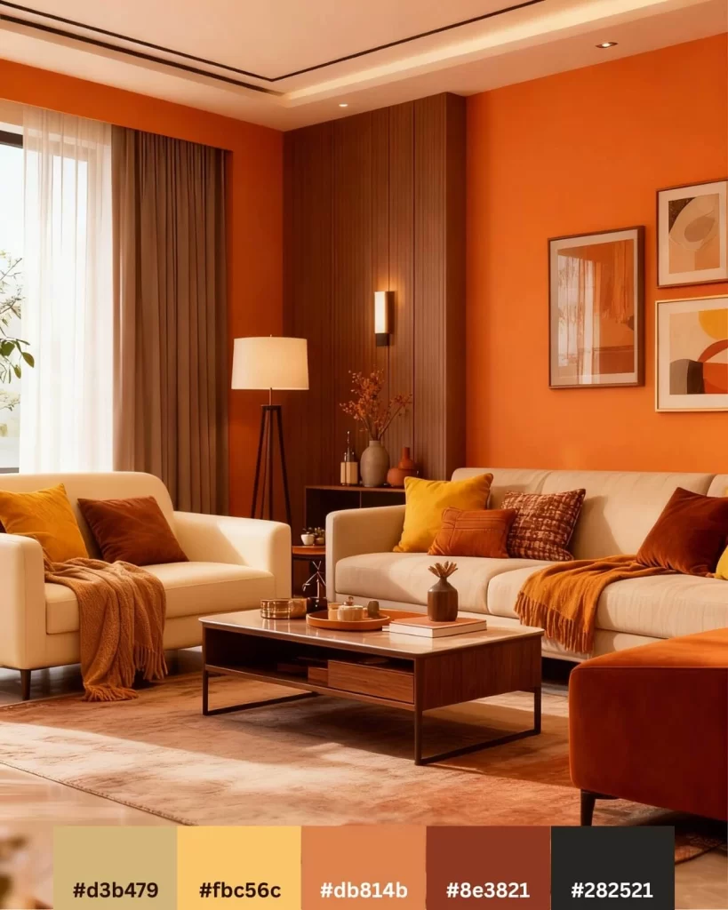
How to style it: This palette loves bold moves. Paint your walls in that warm orange tone. Bring in textiles in rust, golden, and coral shades. For furniture, mix light colors and beautiful woods.
African textiles work beautifully here—Kuba cloth from Congo, mudcloth from Mali, woven pieces from Ghana. They already contain these exact earth tones because they were dyed using natural pigments.
The key is balancing energy with groundedness. You want warmth without chaos.
Our Sunset Picks:
7. Baobab Bark: Earthy Color Palette from Sacred Trees
Madagascar’s Avenue of the Baobabs is jaw-dropping. Those ancient trees, some over 800 years old, have bark that ranges from grey-brown to deep chocolate. The earth around them shifts from pale sand to rich rusty brown.
This earthy color palette brings that same timeless appeal. Grounded, varied, completely confident.

The Colors:
- #e7e0d8 – Light taupe
- #d5d3d2 – Light grey
- #9b8b81 – Taupe
- #a0724d – Walnut
- #5c422f – Espresso brown
Where it works best: Any room where you want a sophisticated, understated feel.
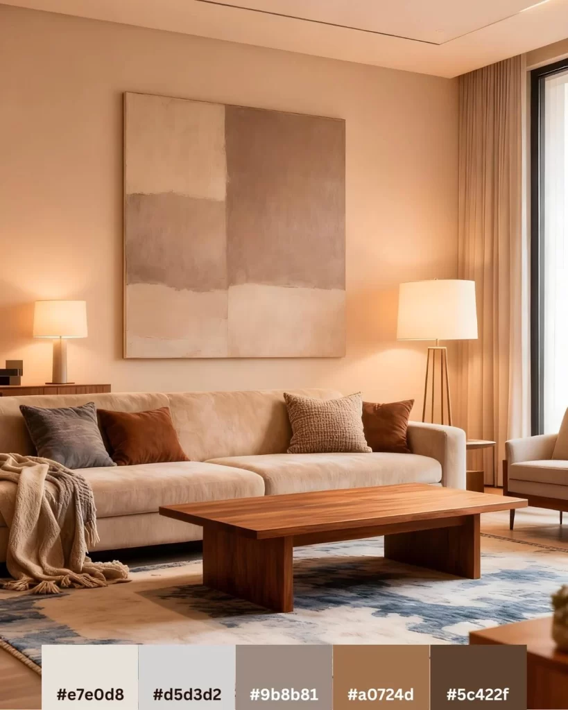
How to style it: Layer your greys and browns deliberately. This palette thrives on subtle variation rather than sharp contrast.
Adding touches of blue works perfectly here. It echoes the infinite sky over the regal baobabs.
Our Baobab Picks:
Making Your Earthy Color Palette Look Spectacular
Here’s what I’ve learned about working with earth tones: they need a few small details to really sing.
- Layer your textures. Smooth painted walls need rough woven textiles. Soft upholstery needs hard wood surfaces. The variation keeps things from feeling monotonous.
- Don’t skip the darkest tones. Rooms done entirely in light earth tones feel washed out. You need those deep browns and rich terracottas to create depth and anchor everything.
- Consider your lighting carefully. Warm bulbs (2700K-3000K) make earth tones glow. Cool lighting makes them look muddy. This one choice changes everything.
Why Earthy Color Palettes Will Never Be Out of Style
Trends come and go. Millennial pink had its moment. Gen Z yellow is having its time now. But earthy color palettes? They’ve existed since humans first mixed clay with water and realized they could create something beautiful.
These aren’t trend colors. They’re the colors of materials we’ve used for thousands of years to build shelter, create art, express ourselves. Walk through any traditional African village and you’ll see these exact shades everywhere. Not because someone designed it that way, but because these are the colors of earth itself.
That connection matters. Your space feels different when it’s rooted in something real instead of something trendy. Plus, these colors make rooms feel like home immediately. Warm, grounded, completely timeless. The kind of spaces where you actually want to hang out instead of just photograph for your feed.